Download IPython notebook for this post.
It's easy enough to make a plot using matplotlib.
import matplotlib.pyplot as plt
import numpy as np

time_point_array = np.arange(0, 5, .1)
y_value_array = np.exp(time_point_array)

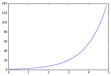
plt.plot(time_point_array, y_value_array)

This plot is not great data science. In fact it's poor data science and it happens all too often. By far the biggest problem is the lack of axis labels, no one (including yourself next week) is going to be able to get any information out of this plot without proper axis labels.
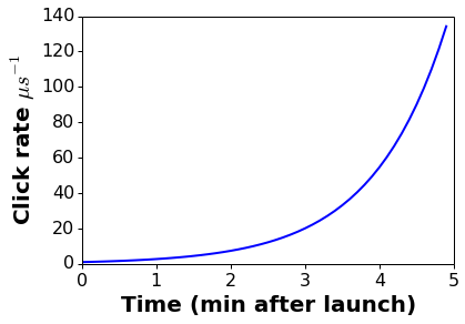
With just a few extra lines this plot can be made presentable. Note that it's easy to include LaTeX formatting in matplotlib plots.
plt.plot(time_point_array, y_value_array, lw=2)
label_format_dict = dict(fontsize=20, fontweight='bold')
tick_format_dict = dict(labelsize=16, direction='out', top='off', right='off',
                        length=4, width=1)
plt.ylabel("Click rate $\mu s^{-1}$", label_format_dict)
plt.xlabel("Time (min after launch)", label_format_dict)
plt.tick_params(**tick_format_dict)

Note how much more readable and presentable the second graph is. It's not going to win any design awards but it could be put in an informal presentation as is. Some of these settings can also be configured in the matplotlibrc file, or via IPython configs but for portability and reproducibility I'd recommend getting them under version control along with the code that produces the plots.
Download IPython notebook for this post
Similar Posts
- Analyzing 10 years of digital photography with python and pandas, Score: 0.949
- Pandas date parsing performance, Score: 0.893
- Pandas Timedelta: histograms, unit conversion and overflow danger, Score: 0.892
- Polar plots and shaded errors in matplotlib, Score: 0.876
- Annotating matplotlib plots, Score: 0.868
Comments